所有可视元素都显示在窗口中。x 和 y 属性存储相对于父元素的元素坐标。Slint 通过将父元素的位置与元素的位置相加来确定元素的绝对位置。如果父元素本身还有父元素,则也会加上其位置。此计算一直持续到达到顶层元素为止。
width 和 height 属性存储可视元素的大小。
你可以通过两种方式放置元素来创建整个图形用户界面:
-显式放置 — 通过设置 x、y、width 和 height 属性。
- 自动放置 — 通过使用布局元素。
显式放置非常适合具有少量元素的静态场景。布局适用于复杂的用户界面,有助于创建可伸缩的用户界面。布局元素表达元素之间的几何关系。
##显式放置
以下示例将两个矩形放置在窗口中,一个蓝色矩形和一个绿色矩形。绿色矩形是蓝色矩形的子元素:
//显式定位export component Example inherits Window { width:200px; height:200px; Rectangle { x:100px; y:70px; width: parent.width - self.x; height: parent.height - self.y; background: blue; Rectangle { x:10px; y:5px; width:50px; height:30px; background: green; } }}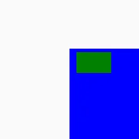
两个矩形的位置和内部绿色矩形的大小是固定的。外部蓝色矩形的大小使用 width 和 height属性的绑定表达式自动计算。计算结果使左下角与窗口的角对齐 — 它会在窗口的 width 和 height发生变化时更新。
在指定任何几何属性的显式值时,Slint 要求你在数字后附加单位。你可以在两种不同的单位之间进行选择:
-逻辑像素,使用 px 单位后缀。这是推荐的单位。 -物理像素,使用 phx 单位后缀
逻辑像素会根据系统配置的设备像素比自动缩放。例如,在现代高 DPI显示器上,设备像素比可以为2,因此每个逻辑像素占用2个物理像素。在较旧的屏幕上,用户界面无需任何调整即可缩放。
你还可以将 width 和 height 属性指定为 %百分比单位,相对于父元素应用。例如,width:50% 表示父元素 width的一半。
x 和 y属性的默认值会将元素在其父元素中居中。
width 和 height 的默认值取决于元素的类型。Image、Text 等元素以及大多数控件会根据其内容自动调整大小。以下元素没有内容,并且当它们没有子元素时默认填充其父元素:
RectangleTouchAreaFocusScopeFlickableSwipeGestureHandlerScaleRotateGestureHandler
布局也默认填充父元素,无论它们的首选大小如何。其他元素,包括不从基类继承的自定义元素,默认使用其首选大小。
###首选大小
你可以使用 preferred-width 和 preferred-height 属性指定元素的首选大小。
如果未显式设置,首选大小取决于子元素,是具有较大首选大小的子元素的首选大小,该子元素的 x 和 y 属性未设置。因此,首选大小是从子元素到父元素计算的,就像其他约束(最大和最小大小)一样,除非显式覆盖。
一种特殊情况是使用 100% 作为值将首选大小设置为父元素的大小。例如,此组件默认使用父元素的大小:
export component MyComponent { preferred-width:100%; preferred-height:100%; // ...}使用布局进行自动放置
Slint附带不同的布局元素,可以自动计算其子元素的位置和大小:
VerticalLayout/HorizontalLayout:子元素沿垂直或水平轴放置。GridLayout:子元素放置在由列和行组成的网格中。
你还可以嵌套布局以创建复杂的用户界面。
你可以使用不同的约束调整自动放置,以适应用户界面的设计。每个元素都有一个最小、最大和首选大小。使用以下属性显式设置这些大小:
min-widthmin-heightmax-widthmax-heightpreferred-widthpreferred-height
具有指定 width 和 height 的任何元素在布局中都有固定大小。
当布局中有额外空间时,元素可以沿布局轴拉伸。你可以使用以下属性控制元素与其同级元素之间的拉伸因子:
horizontal-stretchvertical-stretch
值为 0意味着元素根本不会拉伸。如果所有元素的拉伸因子都为 1,则所有元素均等地拉伸。
这些约束属性的默认值可能取决于元素的内容。如果元素的 x 或 y 未设置,这些约束也会自动应用于父元素。
##布局元素的常见属性
所有布局元素都具有以下共同属性:
spacing:这控制子元素之间的间距。padding:这指定布局内的内边距,即元素与布局边框之间的空间。
为了更细粒度的控制,你可以将 padding 属性拆分为布局每一侧的属性:
padding-leftpadding-rightpadding-toppadding-bottom
VerticalLayout 和 HorizontalLayout
VerticalLayout 和 HorizontalLayout元素将它们的子元素放置在一列或一行中。默认情况下,它们会拉伸或收缩以占据整个空间。你可以根据需要调整元素的对齐方式。
以下示例将蓝色和黄色矩形放置在一行中,并均匀地拉伸到 width 的200个逻辑像素:
// 默认情况下拉伸export component Example inherits Window { width:200px; height:200px; HorizontalLayout { Rectangle { background: blue; min-width:20px; } Rectangle { background: yellow; min-width:30px; } }}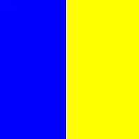
另一方面,下面的示例指定矩形对齐到布局的开头(视觉左侧)。这不会产生拉伸,而是矩形保持其指定的最小宽度:
//除非指定对齐方式export component Example inherits Window { width:200px; height:200px; HorizontalLayout { alignment: start; Rectangle { background: blue; min-width:20px; } Rectangle { background: yellow; min-width:30px; } }}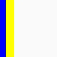
下面的示例嵌套两个布局以实现更复杂的场景:
export component Example inherits Window { width:200px; height:200px; HorizontalLayout { //侧边栏 Rectangle { background: green; width:10px; }
 VerticalLayout { padding:0px; //工具栏 Rectangle { background: blue; height:7px; }
 Rectangle { border-color: red; border-width:2px; HorizontalLayout { Rectangle { border-color: blue; border-width:2px; } Rectangle { border-color: green; border-width:2px; } } }
 Rectangle { border-color: orange; border-width:2px; HorizontalLayout { Rectangle { border-color: black; border-width:2px; } Rectangle { border-color: pink; border-width:2px; } } } } }}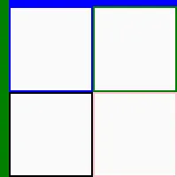
###相对长度
有时使用相对百分比表示长度属性的关系会很方便。例如,下面的内部蓝色矩形的大小是外部绿色窗口的一半:
export component Example inherits Window { preferred-width:100px; preferred-height:100px;
 background: green; Rectangle { background: blue; width: parent.width *50%; height: parent.height *50%; }}
这种以同名父属性的百分比表示 width 或 height 的模式很常见。为方便起见,针对这种情况存在一种简写语法:
- 属性为
width或height-绑定表达式的计算结果为百分比。
如果满足这些条件,则无需指定父属性,你可以直接使用百分比。早期的示例如下所示:
export component Example inherits Window { preferred-width:100px; preferred-height:100px;
 background: green; Rectangle { background: blue; width:50%; height:50%; }}
对齐
每个元素根据其 width 或 height(如果指定)确定大小,否则设置为最小大小,该最小大小由 min-width 或 min-height 属性设置,或由内部布局的最小大小设置,以较大者为准。
元素根据对齐方式放置。元素的大小仅当布局的 alignment 属性为 LayoutAlignment.stretch(默认值)时才大于最小大小
此示例展示了不同的对齐可能性:
export component Example inherits Window { width:300px; height:200px; VerticalLayout { HorizontalLayout { alignment: stretch; Text { text: "stretch (default)"; } Rectangle { background: blue; min-width:20px; } Rectangle { background: yellow; min-width:30px; } }
 HorizontalLayout { alignment: start; Text { text: "start"; } Rectangle { background: blue; min-width:20px; } Rectangle { background: yellow; min-width:30px; } }
 HorizontalLayout { alignment: end; Text { text: "end"; } Rectangle { background: blue; min-width:20px; } Rectangle { background: yellow; min-width:30px; } }
 HorizontalLayout { alignment: start; Text { text: "start"; } Rectangle { background: blue; min-width:20px; } Rectangle { background: yellow; min-width:30px; } }
 HorizontalLayout { alignment: center; Text { text: "center"; } Rectangle { background: blue; min-width:20px; } Rectangle { background: yellow; min-width:30px; } }
 HorizontalLayout { alignment: space-between; Text { text: "space-between"; } Rectangle { background: blue; min-width:20px; } Rectangle { background: yellow; min-width:30px; } }
 HorizontalLayout { alignment: space-around; Text { text: "space-around"; } Rectangle { background: blue; min-width:20px; } Rectangle { background: yellow; min-width:30px; } } }}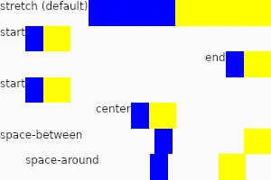
###拉伸算法
当 alignment 设置为 stretch(默认值)时,元素会被调整为最小大小,然后将额外空间按比例分配给元素,比例由使用 horizontal-stretch 和 vertical-stretch 属性设置的拉伸因子决定。拉伸大小不会超过最大大小。拉伸因子是一个浮点数。具有默认内容大小的元素通常默认为0,而默认具有父元素大小的元素默认为1。拉伸因子为0的元素保持其最小大小,除非所有其他元素的拉伸因子也为0或已达到其最大大小。
示例:
export component Example inherits Window { width:300px; height:200px; VerticalLayout { //相同的拉伸因子(默认为1):大小被平均分配 HorizontalLayout { Rectangle { background: blue; } Rectangle { background: yellow;} Rectangle { background: green;} }
 //具有较大 min-width 的元素在扩展之前会被赋予较大的大小 HorizontalLayout { Rectangle { background: cyan; min-width:100px;} Rectangle { background: magenta; min-width:50px;} Rectangle { background: gold;} }
 //拉伸因子是原来的两倍:增长两倍 HorizontalLayout { Rectangle { background: navy; horizontal-stretch:2;} Rectangle { background: gray; } }
 //所有没有最大宽度的元素的拉伸因子为0,因此它们会增长 HorizontalLayout { Rectangle { background: red; max-width:20px; } Rectangle { background: orange; horizontal-stretch:0; } Rectangle { background: pink; horizontal-stretch:0; } } }}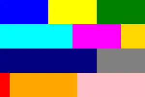
for
VerticalLayout 和 HorizontalLayout 也可以包含 for 或 if表达式:
export component Example inherits Window { width:200px; height:50px; HorizontalLayout { Rectangle { background: green; } for t in [ "Hello", "World", "!"] : Text { text: t; } Rectangle { background: blue; } }}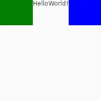
GridLayout
GridLayout 将元素放置在网格中。 每个元素都会获得 row、col、rowspan 和 colspan 属性。 你可以使用 Row 子元素,也可以显式设置 row 属性。 这些属性必须在编译时是静态已知的,因此不能使用算术或依赖属性。目前,在网格布局中不允许使用 for 或 if。
此示例使用 Row元素
export component Foo inherits Window { width:200px; height:200px; GridLayout { spacing:5px; Row { Rectangle { background: red; } Rectangle { background: blue; } } Row { Rectangle { background: yellow; } Rectangle { background: green; } } }}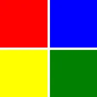
此示例使用 col 和 row 属性:
export component Foo inherits Window { width:200px; height:150px; GridLayout { spacing:0px; Rectangle { background: red; } Rectangle { background: blue; } Rectangle { background: yellow; row:1; } Rectangle { background: green; } Rectangle { background: black; col:2; row:0; } }}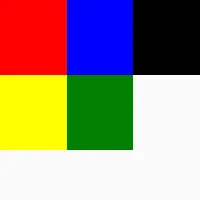
##容器组件(@children)
创建组件时,有时影响使用时子元素的放置位置会很有用。例如,在元素内部绘制标签上方的组件:
export component MyApp inherits Window {
 BoxWithLabel { Text { // ... } }
 // ...}
你可以使用布局实现这样的 BoxWithLabel。默认情况下,像 Text这样的子元素会成为 BoxWithLabel 的直接子元素,但对于此示例,它们需要成为布局的子元素。为此,可以通过在组件的元素层次结构内使用 @children表达式来更改默认的子元素放置:
component BoxWithLabel inherits GridLayout { Row { Text { text: "label text here"; } } Row { @children }}
export component MyApp inherits Window { preferred-height:100px; BoxWithLabel { Rectangle { background: blue; } Rectangle { background: yellow; } }}