默认情况下,Rectangle 只是一个不显示任何内容的空项。通过设置颜色或配置边框, 就可以在屏幕上绘制一个矩形。
当不属于任何布局时,它的宽度和高度默认为父元素的 100%。
slint
export component ExampleRectangle inherits Window {    width: 200px; height: 800px; background: transparent;
    Rectangle {        x: 10px; y: 10px;        width: 180px;        height: 180px;        background: #315afd;    }
    // 带边框的 Rectangle    Rectangle {        x: 10px; y: 210px;        width: 180px;        height: 180px;        background: green;        border-width: 2px;        border-color: red;    }
    // 透明 Rectangle,带边框和圆角    Rectangle {        x: 10px; y: 410px;        width: 180px;        height: 180px;        border-width: 4px;        border-color: black;        border-radius: 30px;    }
    // 半径为 width/2 即可变成圆形    Rectangle {        x: 10px; y: 610px;        width: 180px;        height: 180px;        background: yellow;        border-width: 2px;        border-color: blue;        border-radius: self.width/2;    }}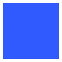
属性
background
brush default: transparent
该 Rectangle 的背景画刷。
slint
property <brush> rainbow-gradient: @linear-gradient(40deg, rgba(255, 0, 0, 1) 0%, rgba(255, 154, 0, 1) 10%, rgba(208, 222, 33, 1) 20%,rgba(79, 220, 74, 1) 30%, rgba(63, 218, 216, 1) 40%, rgba(47, 201, 226, 1) 50%, rgba(28, 127, 238, 1) 60%, rgba(95, 21, 242, 1) 70%, rgba(186, 12, 248, 1) 80%, rgba(251, 7, 217, 1) 90%, rgba(255, 0, 0, 1) 100%);
Rectangle {    x: 10px;    y: 10px;    width: 180px;    height: 180px;    background: #315afd;}

Rectangle {    x: 10px;    y: 210px;    width: 180px;    height: 180px;    background: rainbow-gradient;}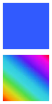
border-color
brush default: transparent
slint
Rectangle { width: 200px; height: 200px; border-width: 10px; border-color: lightslategray;}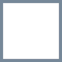
边框的颜色。
Caution
默认的 border-width 为 0px,因此边框不可见。设置颜色后,请确保 border-width 也设置为非零值。
border-width
length default: 0
slint
Rectangle { width: 200px; height: 200px; border-width: 30px; border-color: lightslategray;}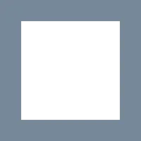
边框的宽度。
clip
bool default: false
slint
// clip: false; 默认Rectangle {    x: 50px; y: 50px;    width: 150px;    height: 150px;    background: darkslategray;    Rectangle {        x: -40px; y: -40px;        width: 100px;        height: 100px;        background: lightslategray;    }}
// clip: true; 裁剪该 Rectangle 的子项Rectangle {    x: 50px; y: 250px;    width: 150px;    height: 150px;    background: darkslategray;    clip: true;    Rectangle {        x: -40px; y: -40px;        width: 100px;        height: 100px;        background: lightslategray;    }}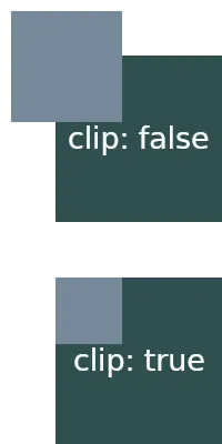
默认情况下,当子元素超出父元素的边界时,它们仍然会显示。当该属性设置为 true 时,该 Rectangle 的子项将被裁剪,仅显示元素边界内的内容。
边框圆角属性
border-radius
length default: 0
圆角的大小。此单个值应用于所有四个角。
要针对不同角使用不同的值,请使用以下属性:
border-top-left-radius
length default: 0px
border-top-right-radius
length default: 0px
border-bottom-left-radius
length default: 0px
border-bottom-right-radius
阴影
要实现视觉上抬高的形状并在元素边框下方显示阴影效果, 可以设置以下 drop-shadow 属性:
drop-shadow-blur
length default: 0px
阴影的半径,也描述了应用于阴影的模糊级别。负值将被忽略,零表示无模糊。
drop-shadow-color
color default: a transparent color
要使用的阴影的基色。通常,该颜色是渐变的起始颜色,渐变最终淡化为透明。
drop-shadow-offset-x
length default: 0px
阴影相对于元素边框的水平距离。
drop-shadow-offset-y
length default: 0px
阴影相对于元素边框的垂直距离。