slint
import { ComboBox } from "std-widgets.slint";export component Example inherits Window { width: 100px; height: 100px; background: transparent; ComboBox { x: 5px; y: 5px; width: 100px; model: ["first", "second", "third"]; current-value: "first"; }}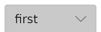
一个按钮,单击后会打开一个弹出窗口以选择一个值。
属性
current-index
int (in-out) default: 0
所选值的索引。
slint
ComboBox { model: ["first", "second", "third"]; current-index: 1;}current-value
string (in-out) default: ""
当前选中的文本
enabled
bool default: true
默认为 true。当为 false 时,无法与该 combobox 进行交互
has-focus
bool (out) default: false
当该 combobox 获得键盘焦点时设置为 true。
model
[string] default: []
可能的值列表
slint
ComboBox { model: ["first", "second", "third"];}Note
设置此属性时,ComboBox 将尝试保留 current-index。 如果 current-index 大于新模型的长度,则会将其设置为模型中的最后一项。
回调
selected(string)
用户从该组合框中选择了一个值。该参数是当前选中的值。
slint
ComboBox { model: ["first", "second", "third"]; selected(value) => { debug("Selected value: ", value); }}